Case File 01
NextGen Flight Planning
Boeing · Enterprise UX · Flight Operations
The challenge wasn’t just designing an interface. It was helping dispatchers make more confident decisions by reducing unnecessary mental workload and making critical information easier to find.
Airline dispatchers monitor flights before and during operation, evaluating changing conditions and helping crews make safe operational decisions.
Company
Boeing
Role
UX Specialist
Users
Airline dispatchers
Product
Next-generation commercial flight-planning software
Ownership
Concept development, research, interaction design, prototyping and usability testing
Collaboration
UX Lead (project direction), Product, Engineering and aviation SMEs
Alerts
My flights: 24
Stage
Plan
File
Release
Out
Off
On
In
Needs attention
2
Wx
Destination ceiling below planning minimums
Now
ZCLD ceiling 400 ft, visibility 1 SM. Forecast to hold through 1900Z.
Affects
XX 214 · XX 402
NOTAM
Runway 09 closed at alternate
6 min ago
ZALT runway 09 closed 1400Z to 1800Z. Alternate needs review.
Affects
XX 214
Monitor
2
Crew
Duty time approaching limit
25 min ago
Crew on XX 118 reaches the limit in 3 h 10 min.
Affects
XX 118
Airport
Deicing capacity reduced
40 min ago
ZBRN reports reduced capacity. Departures may queue.
Affects
XX 356
My flights
XX 214
ZBRN · ZCLD
XX 402
ZDRV · ZCLD
XX 077
ZKLA · ZMNT
XX 118
ZPRT · ZSNW
XX 356
ZBRN · ZHLM
Production interfaces are confidential. Every screen in this case study is a reconstructed example using fictional data and a deliberately different UI.
The problem
The problem wasn’t just fragmented tools. It was decision overload.
Dispatchers were continuously bringing together information from weather, aircraft, airport and operational systems while monitoring multiple flights.
Weather
Changing conditions directly affected flight planning and required ongoing monitoring.
ZCLD
Ceiling 800 ft · Visibility 2 SM
Trend: lowering
Aircraft
Dispatchers needed to confirm aircraft requirements and operational readiness for the planned route.
N114ZZ · Type A
Requirements check for the planned route
Airport
They needed to confirm conditions and constraints affecting departure and arrival.
ZALT
Runway 09 closed 1400Z to 1800Z
Operational information
NOTAMs, MELs, crew information, ATC communications and other flight-related data also fed the decision.
NOTAM
MEL
Crew
ATC
The insight
Dispatchers were mentally assembling information from multiple places to understand the state of a flight. That meant more scanning, more context switching and more mental workload.
Constraints
These constraints forced the team to be intentional about what actually deserved a dispatcher’s attention.
Safety-critical decisions
Situational awareness
Legacy systems that didn’t always talk to each other
Limited access to end users
Reliance on SMEs and volunteer dispatchers
Evolving airline requirements
Requirements that moved to the backlog
Engineering feasibility
Consistency with the broader product
Success principle
Our goal wasn’t to remove complexity. It was to remove unnecessary complexity created by the software.
Reduce unnecessary mental workload · Improve situational awareness · Minimize unnecessary scanning · Show what requires attention · Support confident operational decisions
Research to direction
How dispatchers decide, and what the research changed.
I interviewed dispatchers and aviation SMEs, reviewed other flight-planning tools to see industry patterns, mapped workflows and turned what I learned into wireframes and prototypes that I tested throughout. The pattern that kept coming up: dispatchers were constantly moving between multiple sources of information.
01
Detect
Which flight needs my attention?
Research: critical alerts were scattered through the workflow. Design: one centralized alerts view.
02
Understand
What is happening and why does it matter?
Design: each alert says what it is and which flights it affects.
03
Communicate
Who else needs to know?
Explored concept: connecting alerts to conversation between dispatchers.
04
Act
What needs to happen next?
Design: a hierarchy that puts what needs attention first.
Communication was an explored concept, tested with subject matter experts. It is not presented as shipped functionality.
The alerts experience
Designing for attention, not more information
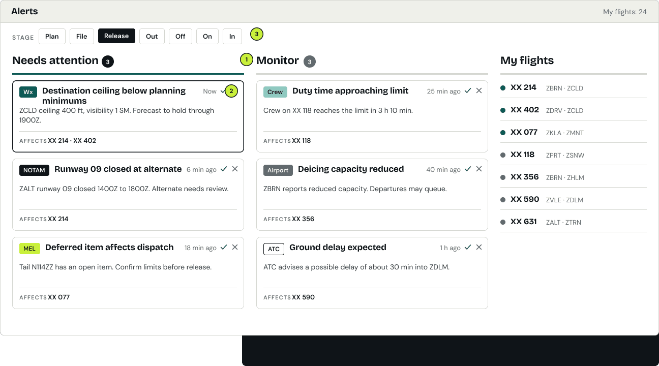
The research pointed to a specific opportunity: critical alerts were scattered throughout the workflow, so dispatchers had to scan several places to know what needed attention. My main responsibility became designing a centralized alerts-management experience.
The decision wasn’t “build a dashboard.” It was helping dispatchers tell what required attention from what could continue to be monitored.
1
Needs attention and monitoring, kept apart
2
Each alert says what it is and which flights it affects
3
Filter by stage of flight
Information organized around the stages of flight
From the research I produced low-fidelity wireframes that tied operational information to the stages of flight, so relevant information was easier to find.

Testing
Visibility wasn’t enough. We needed stronger hierarchy.
How we tested
Sessions of about 30 to 45 minutes with SMEs and experienced aviation users, using task-based scenarios, think-aloud feedback and open discussion.
Who was in the room
Product and engineering partners joined where they could, so the team heard the feedback directly.
What I watched for
Task completion, hesitation, errors, where people slowed down, what they noticed, what they overlooked, and whether the hierarchy supported the decision.
1
Research
Critical information required excessive scanning.
2
Design
Centralize alerts and operational information.
3
Testing
Visibility alone was insufficient.
4
Iteration
Strengthen hierarchy and prioritization.
All alerts (6)
Wx
Destination ceiling below planning minimums
NOTAM
Runway 09 closed at alternate
Crew
Duty time approaching limit
MEL
Deferred item affects dispatch
Airport
Deicing capacity reduced
ATC
Ground delay expected
Needs attention (3)
Wx
Destination ceiling below planning minimums
Affects XX 214, XX 402
NOTAM
Runway 09 closed at alternate
Affects XX 214
MEL
Deferred item affects dispatch
Affects XX 077
Monitor (3)
Duty time approaching limit
Deicing capacity reduced
Ground delay expected
Visible, but flat
With hierarchy
Illustrative
Testing helped us separate what users said they liked from what actually helped them perform the task.
In some cases, the visually preferred solution wasn’t the strongest operational solution.
Alert cards could reduce scanning, but every choice carried tradeoffs in development effort, interaction patterns, product consistency, operational usefulness and safety-critical context. I worked through them with engineering, product and SMEs, and we chose clarity and hierarchy over visual preference. Engineering collaboration continued through QA, and testing helped pressure-test our assumptions against operational behavior and technical feasibility.
Explored concept
Research also surfaced a communication gap.
Dispatchers lacked a strong, centralized place to coordinate with each other around changing conditions. I explored ways alerts and communication could connect, especially during operational changes such as re-routing.
Explored concept · tested with SMEs
Wx
Destination ceiling below planning minimums
Now
ZCLD ceiling 400 ft, visibility 1 SM. Forecast to hold through 1900Z.
Affects
XX 214
Dispatcher conversation
Reroute under discussion
D1
Ceiling at ZCLD is below minimums for XX 214. Checking alternates.
D2
ZALT runway 09 is closed until 1800Z. Looping in crew planning.
D1
Reroute under discussion. I will confirm before release.
This concept was included in SME testing. It is not presented as shipped functionality.
Where it landed
From prototype to a test environment.
The alerts experience
Built into a test environment
The alerts experience advanced beyond prototype work into a test environment, where airline users evaluated it alongside their existing workflows.
The proposed design
Fewer places to monitor
In the proposed experience, critical information was consolidated, so dispatchers had fewer places to check to know what needed attention.
The initiative
Direction shifted
The broader NextGen initiative was later discontinued as organizational direction moved toward other flight-planning products, including ForeFlight and Jet Planner Pro.
Reflection
The biggest lesson wasn’t how to surface more information. It was how to help experienced users recognize what deserved their attention.
Next case file